The short answer
A CEO workforce intelligence dashboard is not a smaller version of the manager dashboard. It is a structurally different artefact built around five board-relevant metrics: utilization band (percentage of the workforce inside a healthy 65-85% productive-time range), throughput delta versus the trailing 12-week baseline (are we accelerating or slowing), blocker concentration heatmap (where waiting time accumulates), attrition risk signal (leading indicator with weeks of warning), and cost of output trend (fully-loaded labor cost per unit of measurable output). It deliberately excludes individual scores, raw activity counts, and hours online, because those metrics belong on the manager screen and create the wrong reflexes when a CEO sees them.
The forcing function is simple: the CEO is making capital-allocation, hiring, and structural decisions on a 90-day horizon, not weekly task triage. Every metric on the dashboard should be one a CEO can act on with a structural lever — restructure, reallocate budget, change a policy, hire, defer a hire — and slow-moving enough that daily oscillation is noise rather than signal. The five metrics above pass that test. Most metrics that show up on default workforce dashboards do not, which is why most CEO dashboards are quietly ignored after the second board cycle.
The CEO vs manager vs HR aggregation problem
The single most common failure pattern in workforce dashboards is showing the same data at every tier. The CEO sees what the manager sees, just with more rows. The manager sees what HR sees, just with more headers. The result is that nobody is making decisions the dashboard was built for, because the level of aggregation does not match the level of decision.
Each tier asks a different question. Managers ask who is blocked today, where is the work stuck this week, what should I clear before standup. HR asks who is at retention risk, where is policy non-compliant, which teams need a culture intervention this quarter. CEOs ask is the company producing more output per dollar this quarter than last, where is the structural bottleneck, what hiring or restructuring move do I need to make in the next 90 days. The right dashboard answers exactly one tier's question at the right grain — daily and individual for managers, weekly and team for HR, quarterly and aggregate for the CEO.
| Tier | Time horizon | Aggregation | Right metric | Wrong metric |
|---|---|---|---|---|
| Manager | Daily / weekly | Individual + team | Blockers, focus blocks, sprint completion | Quarterly trends |
| HR | Weekly / monthly | Team + cohort | Attrition risk, leave anomalies, engagement | Today's task list |
| CEO | Quarterly / annual | Workforce-wide + structural | Utilization band, throughput delta, cost of output | Individual scores, hours online |
This split is also the answer to the privacy and EU AI Act question. CEO-tier metrics are aggregate by construction, which means they cleanly avoid the high-risk-system trap that individual-level AI scoring falls into. Productivity intelligence platforms that ship a CEO view as workforce-wide aggregate from day one solve compliance and decision-quality in the same architecture choice.
The 5 metrics every CEO dashboard should show
These five are the working set we have arrived at after observing how CEOs actually use the dashboards we build for them. Each metric maps to a structural decision a CEO can make.
1. Utilization band
The percentage of the workforce inside a healthy productive-time range — typically 65-85%. Not an individual score. The CEO question this answers is do we have the right amount of capacity. Below the band means the system is over-staffed, has hidden bench, or has a demand problem; above the band means burnout risk, hiring deferred too long, or scope creep. The decision lever is hiring, restructuring, or scope re-prioritization — all CEO-tier moves.
2. Throughput delta vs trailing 12-week baseline
Output velocity this week or month, expressed as a percentage change versus the trailing 12-week baseline. Output is the unit your business actually ships — tickets closed, releases, billable hours, units produced, deals advanced. The 12-week baseline is long enough to wash out single-week variance and short enough to reflect this quarter's reality. The CEO question is are we accelerating or slowing. The decision lever is process change, capacity adjustment, or strategic re-prioritization.
3. Blocker concentration heatmap
A grid where rows are teams and columns are blocker categories — waiting on approvals, waiting on customer, waiting on dependency, waiting on tooling, waiting on hiring. The cells show accumulated waiting time. The CEO question is where is the system jammed, and the answer almost never aligns with where managers think it is. The decision lever is structural — change the approval policy, change the org boundary, invest in tooling, fix a vendor relationship. This metric alone has produced the most board-deck shifts in our customer base.
4. Attrition risk signal
A leading indicator combining workload distribution (sustained over-band utilization), stagnation (no new project assignments, no new skills), and engagement decline (meeting load increasing, focus blocks decreasing, async response patterns shifting). Surfaced as a top-N flagged employees roster with risk score and primary driver — but always at the role and team grain so the CEO conversation stays structural. The decision lever is retention investment, manager coaching, role redesign, or pre-emptive hiring.
5. Cost of output trend
Fully-loaded labor cost per unit of measurable output, quarter over quarter. This is the unit-economics number for the workforce. If it is improving, the productivity intelligence layer is paying for itself. If it is degrading, something structural is wrong and a CEO conversation is required. The decision lever is everything — hiring mix, automation investment, vendor consolidation, pricing.
The 3 anti-metrics CEOs should ignore
Three metrics show up on most default dashboards and produce more harm than signal at the CEO level.
Raw activity counts. Clicks, keystrokes, screenshots, mouse-movement percentages — these are operational telemetry that belongs on the manager screen if anywhere. A CEO who sees them starts asking why team A has fewer keystrokes than team B, which is a question that has no useful answer. The cultural cost is also real: knowing the CEO sees keystroke counts changes how the team works, and not in a good direction. The five signals that actually predict productivity are all aggregate, lagged, and outcome-coupled — none of them are activity counts.
Individual productivity scores in isolation. A CEO who knows that one engineer scored 62 last week now has a privacy problem, a culture problem, and zero useful decision input. Individual scoring belongs to the manager view, with documented purpose, employee inspection rights, and a dispute path. CEO dashboards that include a top-N or bottom-N individual list invite micro-management and undermine the manager structure the CEO built. Strip them.
Hours online. The worst of the three, because it rewards presenteeism and penalizes the deep-focus async workers who are usually the highest-leverage employees. Hours online correlates with neither output nor retention, and it actively distorts behavior — once a team knows the CEO sees hours-online, the calendar fills up with theatre. The metric should not exist on any tier; it definitely should not exist on the CEO screen.
The year-over-year longitudinal view
The single highest-leverage element on a CEO workforce dashboard is the 12-month longitudinal view per team or per role. Every other metric becomes a trend instead of a snapshot. Seasonality becomes visible. The real impact of last year's hiring decisions, last quarter's process change, the durability of an org restructure — all of these become legible on a longitudinal chart and invisible on a point-in-time dashboard.
This is also where the dashboard earns its place in the board deck. CEOs we work with who pulled the longitudinal view into board prep replaced a 14-slide HR appendix with a single chart and a paragraph of commentary, and reported that the quality of board questions improved. The board stopped asking what is happening this week and started asking why has the throughput trajectory in the engineering team flattened over the past four quarters — which is exactly the question the CEO wanted them to ask.
The technical requirement is non-trivial: the platform must retain daily-grain data for at least 12 to 24 months and be able to re-aggregate it on the fly to weekly, monthly, and quarterly cuts without an analyst export. Tools that retain only 90 days of detail (a common default) cannot produce this view. Tools that require an analyst export to re-aggregate produce it stale. Buy or build for the longitudinal capability up front; retro-fitting it is expensive and lossy.
A 64-employee mid-market CEO dashboard layout
For concreteness, here is the dashboard layout we recommend for a 64-employee IT services CEO — the modal mid-market profile in the 25-200 employee band. One screen, five tiles, no scroll.
The CEO opens this screen on Friday morning, spends six minutes on it, and walks into Monday's operating review with three structural questions. That is the entire job of the dashboard. The board version is the same five tiles plotted as 12-month trends. The HR appendix that used to fill 14 slides is now one of those tiles.
Building vs buying the dashboard
The build path looks cheap and is not. The visible cost is a BI tool license — Tableau, Looker, or Power BI Pro — at roughly $5,000-$15,000 per year. The hidden costs are an analyst at 0.5-1.0 FTE to build and maintain pipelines, six to nine months of plumbing before the first chart is dependable, and ongoing data-quality firefighting whenever a source system changes schema. For a 64-employee company, the all-in build cost typically lands at $80,000-$140,000 in year one and $40,000-$80,000 per year ongoing.
| Path | Year 1 cost | Time to first chart | Ongoing FTE | Best fit |
|---|---|---|---|---|
| Build (BI + analyst) | $80k-$140k | 6-9 months | 0.5-1.0 | 500+ employees with existing data team |
| Buy (purpose-built platform) | $4k-$12k | 2-4 weeks | 0 | 25-250 employee mid-market |
| Hybrid (platform + BI overlay) | $15k-$35k | 4-8 weeks | 0.25 | 250-500 employees with custom KPIs |
The break-even for a build only tilts past roughly 500 employees, multiple business units, and a data team already in place for non-workforce reasons. Below that, a purpose-built productivity intelligence platform with the five CEO metrics included is the right answer — typically $4,000-$12,000 per year all-in for the 25-250 employee band. gStride pricing includes the CEO dashboard layer and the longitudinal retention by default; the AI signal layer is not a premium up-sell. The math is also why we built the platform — the alternative was watching mid-market CEOs pay $100,000+ for a worse version of the same five tiles.
Two related buyer's guides extend this analysis: how to compare AI productivity tools covers the eight evaluation dimensions, and the ROI calculator guide covers the math at the line-item level — fully-loaded cost of output, manager hours saved, analyst headcount avoided. Both pair with this dashboard piece for a complete CEO-buyer kit.
What to ask vendors on the demo call
Five questions cut through the marketing decks and produce a clean yes or no on whether a vendor's platform actually ships a CEO-grade dashboard.
- Show me the CEO view at a 64-employee customer. Real screen, real customer (anonymized). If the demo is a slide, you are seeing a roadmap, not a product.
- Show me the 12-month longitudinal view per team. Hover the chart. If the platform retains only 90 days of daily-grain data, the longitudinal view is fake and the board-deck workflow will fail in month four.
- Show me a CEO dashboard with no individual scores and no hours-online tile. If the vendor's product cannot configure those off, the platform is operationally a manager dashboard rebadged.
- Show me how the EU AI Act audit log works for the attrition risk signal. Trace one flagged employee back to capture data, signal definition, and human action. If the trail breaks anywhere, the platform fails high-risk-system review.
- What is the all-in price including the AI layer, longitudinal retention, and SSO at our headcount and at 2x our headcount. The slope of those two numbers tells you whether the pricing model fits the next 24 months.
Vendors that answer all five cleanly are the shortlist. Vendors that pivot to it depends on your specific configuration are signalling that the CEO dashboard is a marketing artifact, not a product surface — and the post-sale experience will reflect that.
Free: 5-Signal Productivity Self-Audit Worksheet
30-min audit on your team. Focus depth + commit cadence + meeting load + flow-state + blocker recovery. PDF + Google Sheets calc. For Ops Heads, Founders, Eng Managers.
Frequently asked questions
What is a workforce intelligence dashboard for CEOs?
A workforce intelligence dashboard for CEOs is a single-screen view of five board-relevant operating metrics — utilization band, throughput delta versus the trailing 12 weeks, blocker concentration heatmap, attrition risk signal, and cost of output trend. It deliberately excludes manager-level operational metrics (individual scores, raw activity counts, hours online) because the CEO is making capital-allocation, hiring, and structural decisions, not weekly task triage. The dashboard's job is to show whether the workforce is producing more output per dollar this quarter than last, where the system is bottlenecked, and which signals need a structural intervention rather than a manager conversation.
What 5 metrics should a CEO workforce dashboard show?
Utilization band (the percentage of the workforce inside a healthy 65 to 85 percent productive-time range, not an individual score), throughput delta versus the trailing 12-week baseline (output velocity change, not raw counts), blocker concentration heatmap (where waiting time accumulates by team and by category), attrition risk signal (a leading indicator combining workload, stagnation, and engagement decline), and cost of output trend (fully-loaded labor cost per unit of measurable output, quarter over quarter). These five answer the questions a CEO actually asks: are we under or over capacity, are we accelerating or slowing, where is the system jammed, who am I about to lose, and is the unit economics improving.
What metrics should CEOs ignore on a workforce dashboard?
Three anti-metrics produce more noise than signal at the CEO level. Raw activity counts (clicks, keystrokes, screenshots) are operational telemetry that belongs to the manager view, not the boardroom. Individual productivity scores in isolation invite the wrong conversation — a CEO who knows that one engineer scored 62 last week now has a privacy and culture problem and no useful decision input. Hours online is the worst of the three, because it rewards presenteeism and penalizes deep-focus async workers. CEOs that put any of these on the dashboard pull themselves into manager-tier decisions and abdicate the structural questions only they can answer.
Why does a CEO need a different dashboard than a manager or HR?
Each tier asks different questions. Managers ask who is blocked today, where is the work stuck this week, and what should I clear before standup. HR asks who is at retention risk, where is policy non-compliant, and which teams need a culture intervention. CEOs ask is the company producing more output per dollar this quarter, where is the structural bottleneck, and what hiring or restructuring decision do I need to make in the next 90 days. Putting manager-grade metrics on a CEO dashboard creates the impulse to micromanage and obscures the structural signal. Putting CEO-grade metrics on a manager dashboard produces vague aggregates that cannot drive Tuesday actions.
How important is a year-over-year longitudinal view on a CEO dashboard?
It is the single highest-impact element, because every other metric becomes a trend instead of a snapshot. A 12-month productivity graph per team or per role surfaces seasonality, the real impact of last year's hiring decisions, the durability of process changes, and the slow drift that point-in-time dashboards miss entirely. The CEOs we work with who pulled this longitudinal view into board prep replaced a 14-slide HR appendix with a single chart and got better questions from the board. The technical requirement is that the platform retains daily data for at least 12 to 24 months and can re-aggregate it on the fly without an analyst export.
What does a CEO workforce dashboard look like for a 64-employee company?
For a 64-employee mid-market company, a CEO dashboard fits on one screen with five tiles. Top row: utilization band gauge (showing what percentage of the 64 are inside the healthy band) and throughput delta sparkline (output index versus the trailing 12-week baseline). Middle row: blocker concentration heatmap (rows are teams, columns are blocker categories — waiting on approvals, waiting on customer, waiting on dependency, waiting on tooling). Bottom row: attrition risk roster (top five flagged employees with risk score and primary driver) and cost of output trend (fully-loaded cost per shipped unit, last four quarters). No individual scores, no raw activity counts, no hours-online tile.
Should we build the CEO workforce dashboard ourselves or buy a platform?
For a company under 250 employees, build is almost always the wrong answer. The visible cost is the BI tool license (Tableau, Looker, Power BI Pro) at roughly $5,000 to $15,000 per year, which looks cheap. The hidden costs are an analyst at 0.5 to 1.0 FTE to maintain pipelines and respond to data questions, plus six to nine months of pipeline plumbing before the first chart is dependable. A purpose-built productivity intelligence platform with the five CEO metrics included costs $4,000 to $12,000 per year all-in for that headcount band. The break-even tilts toward build only past 500 employees with multiple business units and a data team already in place.
How often should a CEO look at the workforce intelligence dashboard?
Weekly for the live view, monthly for the operating-review readout, and quarterly for the longitudinal cut that goes into the board deck. Daily checks pull the CEO into manager work and produce false-positive reactions to single-day variance. The five metrics on the dashboard are deliberately chosen to be slow-moving (12-week baselines, quarter-over-quarter trends, leading indicators with weeks of warning) — daily oscillation in any of them is noise. CEOs that set a Friday or Monday cadence on the dashboard report better operating-review quality and fewer reactive interventions than CEOs who refresh it daily.
How does the EU AI Act affect a CEO workforce dashboard?
From August 2026, AI systems that influence workforce decisions are classified as high-risk under the EU AI Act and require explainability, documented data sources, human oversight, and an audit trail per recommendation. CEO dashboards that display individual-level AI scoring without an inspectable model trace fall directly into the high-risk category. The compliant pattern is exactly the one this article advocates: aggregate the metrics to team and role level, expose the data sources and signal definitions, route any individual-level surfacing through a manager view with a documented purpose, and retain the audit log. CEOs that adopt the five-metric pattern from day one avoid retrofitting the dashboard for compliance later.
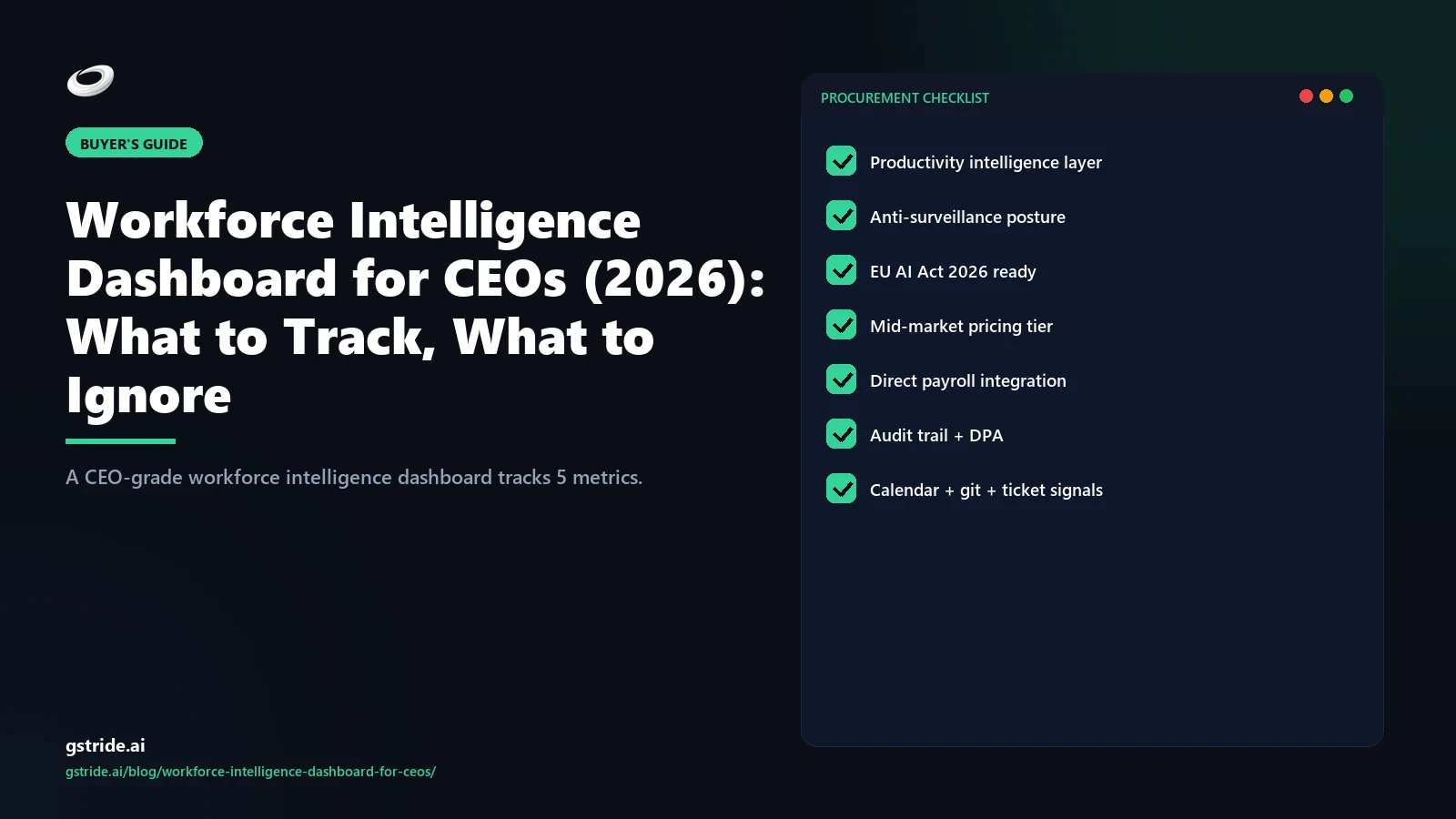
Free: CISO Procurement Checklist for AI Productivity Vendors
10 questions every CISO should ask before signing — data residency, DPIA, AI auditability, breach SLA, retention, SCIM/SSO, sub-processors, right to audit. Includes scoring rubric and pass / hold / walk thresholds.
Related reading on gStride
- AI productivity intelligence platform — the canonical 4-layer category guide
- How to compare AI productivity tools — vendor-neutral 8-dimension framework
- Best productivity tool for a 50-employee company — mid-market buyer's guide
- Employee productivity software ROI calculator — justify the switch with real numbers
- AI assistance — the signal and recommendation layer in gStride
- gStride pricing — banded mid-market tiers, AI and longitudinal retention included
See the CEO dashboard layout in gStride
The five metrics, the 12-month longitudinal view per team, and the blocker concentration heatmap — on a real workforce, not a slide. 20-minute walkthrough.
See pricing for 25-250 seats Read the category pillarCost ranges and dashboard layouts reflect mid-market customer patterns observed across the gStride customer base in early 2026. EU AI Act high-risk-system obligations begin August 2, 2026; specific compliance requirements vary by jurisdiction and intended use case. Verify with counsel before relying on any dashboard layout for AI Act conformity.