The short answer
The remote team productivity metrics that actually matter are the ones produced by the work itself — not by the worker's machine. Five carry almost all the signal: deliverable velocity (committed scope shipped per cycle), async legibility score (the percentage of decisions documented in writing), blocker resolution time (mean hours from raise to unblock), cycle-end retro signal (the percentage of work that hits planned scope), and Trust-Net Promoter Score (whether your team would recommend this manager to a friend, asked quarterly). The first four measure how the work moves. The fifth predicts whether the people will still be on the team in six months.
The four metrics most remote teams are still measuring instead — keystroke count, hours-online, screenshot frequency, and response-latency-under-five-minutes — feel like productivity but track activity theater. A developer reading documentation for 40 minutes logs as idle under a keystroke threshold but is doing the highest-leverage work of the day. A junior typing aggressively at 2 a.m. is a burnout flag, not a productivity win. The "responds within five minutes" badge usually belongs to the person most addicted to the app and least able to do focused work.
The rest of this guide is the case for the swap: why the four vanity metrics persist, what each real metric looks like in practice, the cognitive bias that keeps managers grabbing the wrong dashboards, and a four-step rollout that does not detonate trust on the way in.
The 4 vanity metrics that don't matter
Every team I have seen measure the wrong things had a manager who got nervous and reached for a metric that produced large, fast-changing numbers. The numbers were comforting. They also produced almost no information. These four come up most. Each looks real. None is.
1. Keystroke count
Keystrokes-per-hour does not predict output. A senior engineer thinking through an architecture problem types nothing for an hour and produces a quarter's worth of value. A copy-paste-heavy junior produces high counts and shallow work. The metric mostly measures how typing-intensive the work happens to be — not whether the work is any good.
2. Hours-online
The Slack green dot, the Teams active badge, the dashboard that says someone has been online for 11 hours — none of it correlates with output. It correlates with someone leaving their laptop open. It also incentivises presence theater: stay logged in to look productive instead of logging off when the work is done.
3. Screenshot frequency
Continuous or high-frequency screenshots generate a sea of data nobody has time to read, real privacy concerns, and resentment that costs more than the dashboard delivers. The narrow cases where screenshots earn their place are billable client work and specific compliance contexts — not general performance. We covered the configurable-by-role matrix in how often should you take employee screenshots.
4. Response latency under 5 min
The "always responsive" badge rewards interruption-readiness over deep work. The person who replies in three minutes is the one who left their notifications on; the person who replies in three hours often shipped the actual feature. Sub-five-minute response targets are correlated with Slack addiction, not output.
Each of these rewards activity over outcome, makes the team feel watched, and produces the exact behavior it was trying to prevent. The first month they look like wins; by month three the strongest people are taking calls from recruiters. I have watched this arc at three companies. The numbers go up because everyone is performing for the dashboard, then stay flat while output quietly declines because the wrong people are leaving.
None of this means the underlying signals are useless everywhere. Activity capture has legitimate uses in billable services, regulated industries, and specific incidents — covered in productivity monitoring without surveillance. The argument here is narrower: do not use these four as headline performance metrics for general remote knowledge work.
The 5 metrics that actually matter
Strip remote productivity measurement down to what genuinely correlates with shipping work and keeping the team intact, and five signals do almost all the work. None comes from a real-time activity feed. All are visible in tools the team already uses. All survive the move from a 5-person startup to a 500-person org.
1. Deliverable velocity (output per cycle, not per hour)
Committed scope shipped per cycle — tickets closed against committed, PRs merged, designs delivered, contracts signed, support tickets resolved at first touch. The framing matters: per cycle, not per hour. Hourly velocity penalises deep work and rewards easy tickets. Per-cycle velocity rewards finishing the thing you said you would finish. Compare each person against what they committed to at the start of the week — not against a fictional capacity number.
The honest version includes quality. A team that ships 80% of committed scope clean beats one that ships 110% half-baked. Track both.
2. Async legibility score (% of decisions documented in writing)
The percentage of decisions on a team written down somewhere a teammate could find them six months later — in a Linear ticket, a Notion doc, a pinned Slack thread, an ADR. High legibility teams scale across time zones because the answer to most questions is searchable. Low legibility teams scale by adding meetings, which fails fast async.
To measure: at the end of each cycle, sample ten decisions made that week and count how many have a written artefact a new joiner could read. Above 70% predicts smooth onboarding. Below 40% predicts that one departure takes the institutional memory of three projects with it.
3. Blocker resolution time (mean hours from raise to unblock)
How long does a blocker sit between when it is surfaced and when it is cleared? Track the mean and the p90 — the mean is the team's normal, the p90 tells you when something is wrong. A flat or improving slope predicts team health more accurately than any individual output metric, and the metric reveals invisible managerial drag: if every blocker waits four days for one director, you have an org-design problem the activity feed will never surface.
4. Cycle-end retro signal (% of work that hits planned scope)
At the end of each sprint, what percentage of work shipped within the originally committed scope versus shipped with material scope cuts, partial delivery, or rollover? This is the honesty metric. It catches chronic overcommitment, unnamed scope-creep, and the slow death of the planning ritual.
A healthy band is 70-90%. Below 70% means the team is committing to more than it can deliver. Above 90% for several cycles usually means people are sandbagging because the cost of missing is higher than the reward for hitting.
5. Trust-Net Promoter Score (would your team recommend this manager?)
One anonymous question, every quarter: would you recommend this manager to a close friend who was looking for a new role? Score 0 to 10. Subtract detractors from promoters. Trust-NPS is the single best leading indicator of attrition I have ever seen tracked — it captures what exit interviews capture six months too late.
It works because the question is sharp. "How engaged are you?" is easy to game; "would you tell your friend to take this person's offer?" is much harder. The number tends to predict resignations one or two quarters before they happen — exactly the lead time you need to fix the problem rather than backfill the role.
Vanity vs Real: a side-by-side
The simplest way to see why teams keep reaching for the wrong metrics is to lay them next to the right ones and compare what each one is actually measuring.
| Vanity metric | What it actually measures | Real metric to use instead |
|---|---|---|
| Keystroke count | How typing-intensive the role is | Deliverable velocity (committed scope shipped per cycle) |
| Hours-online / green-dot time | Whether the laptop is open | Cycle-end retro signal (% of planned scope shipped) |
| Screenshot frequency | Manager anxiety, not output | Async legibility score (% of decisions written down) |
| Response latency under 5 min | Notification addiction | Blocker resolution time (mean hours from raise to clear) |
| Engagement-survey score (annual) | How recently the survey ran | Trust-NPS (would they recommend the manager — quarterly) |
The honest test for any productivity metric: if the manager could not explain in one sentence what specific decision the number informs, the number should not be on the dashboard. "Just in case" is the most expensive policy in workforce software.
The "looks busy" trap
Vanity metrics persist because of a cognitive bias called visibility-as-performance: the brain rewards visible activity over invisible deep work because visible activity is easy to perceive. In an office the bias is partially corrected by physical cues — body language, who is at the whiteboard, who is in a focused posture. Remotely, the cues vanish. The brain still wants the signal, so it grasps at proxies it can see: green dots, fast replies, packed calendars, late-night messages.
A 2022 Microsoft Work Trend Index named the broader pattern "productivity paranoia": 85% of leaders said hybrid work made it harder to trust employees while 87% of employees said they were productive. Visibility-as-performance bias tries to close that gap and the proxies it reaches for — keystrokes, hours-online, screenshots — make it worse.
The fix is structural. Make outcomes visible at a weekly cadence so the brain stops grasping at activity proxies. Publish the cycle-end retro signal. Read the blocker queue, not the live activity feed. Move the conversation from "who is on" to "what shipped." For the rollout that pairs with this — including a 7-point foundation — see how to track remote employee productivity without killing morale.
How to roll out new metrics without team backlash
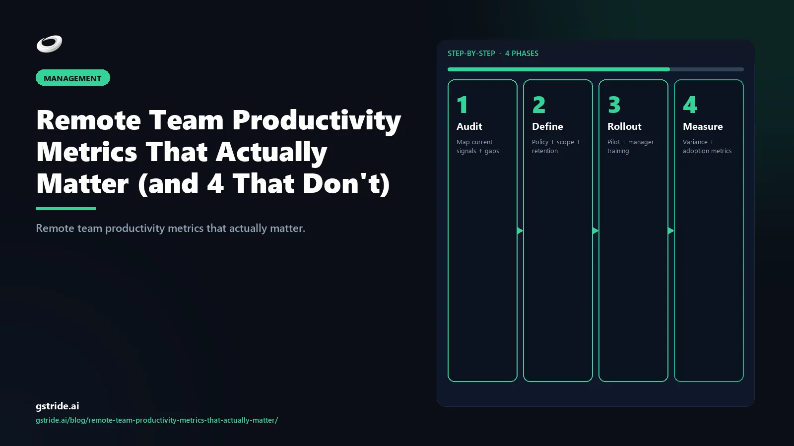
Replacing vanity metrics with real ones is mostly a change-management problem. The technical part takes a week; the trust part takes a quarter. Here is the four-step rollout that has worked at every team I have run it at — and the failure mode for each step that has not.
- Subtract first, add second. In the same announcement that introduces the five real metrics, publicly turn off the four vanity ones. Switch off the keystroke dashboard. Stop reading hours-online. Set screenshot capture to opt-in or off entirely. Drop the five-minute response expectation. Subtracting first earns the trust required to add at all. Failure mode: announcing the new metrics while quietly leaving the old ones running. Everyone notices.
- Make the dashboard symmetric. Whatever the manager sees, the employee sees first. Trust-NPS is anonymous and aggregated; everything else is visible in the employee's own view. Symmetry of information is the single biggest predictor of whether a measurement program survives its first quarter. Failure mode: a manager-only dashboard. Even with the right metrics, the secrecy poisons the program.
- Run the first cycle as a calibration, not an evaluation. Use the first 4 weeks to see what numbers actually look like. No performance conversations tied to the new metrics. No comparisons across people. Just baselining. Failure mode: judging people on numbers they have never seen produced before.
- Schedule a 30-day retro and kill what nobody read. At day 30, run a written retrospective. What metric drove a decision? What metric did nobody read? Turn off everything in the second column. Repeat every quarter. Failure mode: accumulating metrics. The fastest way to recreate the surveillance vibe is to keep adding without ever subtracting.
The four steps are boring. They are also the difference between a measurement program that survives a year and one quietly disabled when the next leadership arrives. Pair them with a tool stack that lets you toggle each signal independently — gStride's productivity monitoring and automated time tracking are built around exactly this. For the broader pillar context, see AI time tracking software.
FAQ
Related reading on gStride
- How to Track Remote Employee Productivity Without Killing Morale
- Productivity Monitoring Without Surveillance — What Actually Works
- How Often Should You Take Employee Screenshots? Best Practices for 2026
- AI Time Tracking Software — A Complete 2026 Buyer's Guide
- Productivity Monitoring — role-specific dashboards
- Automated Time Tracking — context without surveillance
Free: 5-Signal Productivity Self-Audit Worksheet
30-min audit on your team. Focus depth + commit cadence + meeting load + flow-state + blocker recovery. PDF + Google Sheets calc. For Ops Heads, Founders, Eng Managers.
Frequently asked questions
What productivity metrics actually matter for remote teams?
Five metrics carry almost all the signal: deliverable velocity (committed scope shipped per cycle), async legibility score (the percentage of decisions documented in writing), blocker resolution time (mean hours from a blocker being raised to being cleared), cycle-end retro signal (the percentage of work that hits planned scope), and Trust-Net Promoter Score (whether your team would recommend this manager to a friend). The first four measure how the work moves; the fifth predicts whether the people will still be on the team in six months.
Why are keystroke counts a vanity metric?
Because typing volume does not correlate with output for most knowledge work. A developer reading documentation for 40 minutes logs as idle under a keystroke threshold but is doing the highest-leverage work of the day. A junior typing aggressively at 2 a.m. produces a high keystroke count and a burnout risk. Keystrokes-per-hour mostly measures how typing-intensive the work happens to be, not whether the work is good.
What is async legibility score?
Async legibility score is the percentage of decisions on a team that are written down somewhere a teammate could find them six months later — in a Linear ticket, a Notion doc, a Slack thread, an ADR. High legibility teams scale across time zones because the answer to most questions is searchable. Low legibility teams scale by adding meetings, which fails fast in remote and async configurations.
How is Trust-Net Promoter Score different from a regular employee survey?
Trust-NPS asks one question on a quarterly cadence: would you recommend this manager to a close friend who was looking for a new role? It is a leading indicator of attrition because it captures the social-trust dimension that exit interviews capture too late. Regular engagement surveys ask broader questions on slower cycles and are easier to game. Trust-NPS is harder to game because it is about a specific person and the ask is sharp.
Are hours-online useful as a productivity metric?
Almost never. The Slack green dot, the Teams active badge, the dashboard that says someone has been online for 11 hours — none of it correlates with output. It correlates with someone leaving their laptop open. Worse, it incentivises presence theater: people stay logged in to look productive instead of logging off when the work is done. Hours-online is a vanity metric in every context except literal shift-attendance scheduling.
Should screenshot frequency ever be used to measure productivity?
Not for performance management. Continuous or high-frequency screenshots produce a sea of low-signal data nobody has time to read, generate legitimate privacy concerns, and earn the team's resentment for almost no operational benefit. The narrow cases where screenshots earn their place are billable client work, regulated environments, and specific incident contexts — and even there, opt-in or event-triggered capture is the right default.
How do I roll out new productivity metrics without team backlash?
Run a four-step rollout. Step one: write the policy before the tool, including which metrics will be tracked and what decisions they inform. Step two: switch off every vanity metric currently being read, publicly, in the same announcement. Step three: make the dashboard symmetric — employees see what managers see. Step four: schedule a 30-day retrospective where any metric that did not drive a decision gets retired. Backlash usually comes from adding without subtracting; subtracting first earns the trust to add later.
What is the looks-busy trap in remote management?
It is the cognitive bias where managers reward visible activity (fast Slack replies, packed calendars, late-night messages) over invisible deep work (long blocks of focused thinking, time spent reading, careful design). It is more dangerous remotely because the visual cues that compensate in person — body language, posture, who is at the whiteboard — are gone. The fix is to make output visible at a weekly cadence so the brain stops grasping for activity proxies.
Measure the work, not the worker
gStride is built for teams that want one source of truth on time, projects, and capacity — without the always-on activity feeds. Configure each signal independently, show employees their own data first, and ship the dashboards you can defend.
Explore productivity monitoring See pricing